Book cover illustrations are probably my favorite type of assignment. While judging a book from the outside will not always lead you in the right direction, it is hard not to be intrigued by a connection you make at first sight. Book cover assignments are puzzles to be solved with many potential solutions.
The puzzle usually presents itself with a tale and a target audience. In the case of Grayling's Song, (the story of a young, timid girl who is faced with a challenge and forced to venture out into the world on her own) the book's main audience is 9-to-12-year-old girls. Though there will be exceptions, the cover needs to speak to the book's core. Grayling's Song's remarkable author, Karan Cushman, has been a force (and a Newbury winner!) with a number of wonderful and long-lived (and loved) historical fiction books on the shelves. Grayling's Song is her first fantasy novel. Because of this, I felt like the cover needed to be simple and classic in some way so that her current fans would pick it up, but executed in such a way that separates it from Karen's previous work.
So here is a breakdown of the process involved in creating the cover illustration for Grayling's Song. If you are a fellow illustrator, much of this may be common knowledge, but for others I've tried to explain all potentially unfamiliar terms.
The first step in this process was to read the book. I can't believe I have a job that requires I read lots of wonderful stories well before they hit the shelves! While reading, I'll take notes and make lists of whatever comes to mind. Adjectives, words, characters, moods - anything could prove helpful during the process. These words often help me along later if I get stuck.
Then I begin by making thumbnail sketches. These are very small and quick drawings that start to show basic layouts of potential cover concepts. In the case of Grayling's Song, my approach was quite straightforward. This image needed to focus on the star of the story. While the scene and other story elements could enhance the image, this book called for a portrait of the book's heroine and her tiny talking-and-shape-shifting pet named Pook. Once I create these tiny drawings, I pick my favorites and draw them a bit larger (about 3 inches tall) so that others can read them clearly. I leave room for type, but in this case and at this stage I didn't choose to add my own. I also usually add a bit of value to my sketches to help them be read more easily.
I sent my cleaned-up sketches to the art director for feedback. In this case I was personally hoping for the top-middle image because I'm a sucker for a head-on decorative portrait (as evidenced in my Society of Seekers series) , but it was requested that I try some color studies of the lower right image. I can get on board with trees that have faces too, so this was fine with me.
For my color studies, I scan my sketch into the computer and bring it into Photoshop. I "multiply" the drawing layer (this is a command that makes the white/light parts of the image transparent) and a add quick broad strokes of digital color behind my image. I will sometimes add a layer on top of my drawing for highlights if they are important in the particular sketch. This is a reasonably fast way to try out different ideas. I usually send 2-4 color options to the art director. In this case, one of the worries was a that a forest full of trees would appear brown and drab, and I did not have much interest in drawing a dull book cover. But generally if your values are good in an image (the darks and lights are well balanced and easily read) you can really play around with color for a more dynamic palette, so I went in that direction.
After seeing this sketch in color and adding tentative type, the publisher wanted to go back and revisit another sketch. Covers are so important as to how a potential reader views a book -and they are often tricky to get just right- so it is not uncommon to pursue multiple possibilities before settling. Sometimes seeing an idea in color (or with the type in place) can really change how it feels. Alas, we went back to the top left sketch on my page of choices and took out the butterfly graphic (which was meant to hold the title text). I delivered a loose update to make sure we were on the same page and we tinkered from there.
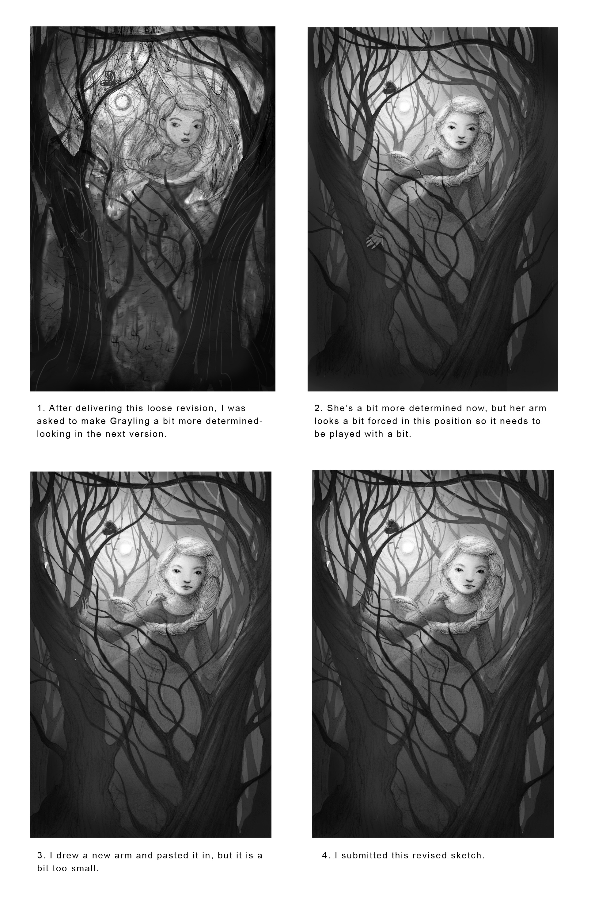
The above image shows the process in getting the sketch ready for approval. Lots of details are figured out in this stage.
The final sketch was working, except that Grayling looked a bit too prickly here for the cover. Too determined, perhaps. Nevermind that she's in over her head, running from attackers or out on her own for the first time, of course. It is a justifiable habit to make lead characters appear welcoming and hopeful on covers. And I suppose even though in the scene from which I envisioned this illustration she is supposed to be escaping and scared, it makes sense to have the cover image represent the overall hope that she and the reader have of saving her mother and community. And I do have a habit of making my girls look mean and/or sad and/or completely indifferent, so this request was hardly unprecedented or unjustified.
So I drew Grayling a new face. With a thinner braid (another small request). I must have been watching too much Elsa with my three-year-old when I made the original call. I do like drawing hair, and can get carried away in that regard.
On to color studies of the new approved sketch.
Often the basic place to start with color studies is to create one with a warmer palette and one with a cooler palette.
While I often deliver 3+ color studies, in this case two really came forward and there wasn't a need for more. This image is not complicated, and we'd already established that Grayling's dress needed to be a color that could have been dyed naturally for the time period, settling on a burnt orange or a berry color. With this in place, I created one warmer and one cooler option. It should also be mentioned that in the story Grayling's hair is actually gray even though she is a young girl. The publisher chose the option on the left, with the warmer feel. We also came to the conclusion that instead of making the image more soft and rendered, we'd try a more flat and graphic look, but with some gradation for atmosphere. This would be a bit of an experiment for me but I was excited to give it a try. The first step was to create multiple ink drawings. (Although I know plenty of illustrators who'd head straight to a digital drawing, I'm not quite there yet.) I wasn't sure how to separate the colors exactly in this image, so my best bet was to create many layers of drawings to give me flexibility with color and value in the final product. So I made approximately nine ink drawings (each a little larger than actual size) and scanned them into my computer at 600 dpi (I like to have a file that could be printed at poster size if need be for promotional purposes.)
These are all of the drawings I scanned and layered in Photoshop. I only outlined those areas that would be flat in color in the final image because they can be easily and quickly filled in with the paint bucket in Photoshop.
Then it was time to stack these images on top one another in Photoshop. I "multiply" the individual drawings in the layers palette so that I can see what is behind each one and fit them in like a puzzle on top of my original sketch. The layer with Grayling's face below is not yet "multiplied", so you can still see the white around the drawing in that spot.
This image shows what my layered file looked like as I began stacking the layers of drawings in.
At this point, I start playing with color within the approved palette. I often use "screen" (a setting in the paintbrush bar) to colorize my black designs. I try to loosely block it all in before getting overly detailed. I sent the image below to the publisher to show progress. Even though the image looks close to finish, it is really in the final hours that the illustration comes to life. Usually that difference is giving attention to highlights and texture - two things that I regularly fill in last once the general colors and values are in place.
Here the layers are all sitting in about the correct place in about the correct colors. This is where I go through each layer and fix and add details, highlights and textures to hopefully create a more cohesive and emotional piece.
The publisher liked the progress piece very much, with only the comment that perhaps Grayling's hair should go more golden in the light. Although Grayling's hair is gray in the story, it might be confusing to read this on the cover of the book, and it makes Grayling seem like perhaps she is not a young girl at first glance. So I shifted the hair to warm it up a bit. The final piece has more texture throughout. I used Kyle Webster's digital salt brush (in his watercolor set) for the spatter-y starry look in the sky. and some of the texture in the trees and Grayling's dress.
To someone who picks up the book, the final image appears as a simple portrait, and I suppose that is true. But as this post shows, even when a cover concept is simple, there are usually many steps that go into conceiving and creating it! And adding a few narrative elements is key. Pook (the talking mouse) is sitting upon Grayling's shoulder, and a Grayling butterfly perches in the tree. The forest setting is important to this tale, and Grayling looks as if in motion, on her adventure, as her hair is swinging. Her expression is hopeful, and the texture and light give the piece a subtle sense of magic. All of these choices are important in a cover and what a potential reader will feel when they see it. Once the art is finished, lettering is added, and print decisions are made. In this case, Grayling's Song was printed on a gorgeous subtly-shimmery paper with an embossed title. This adds to the magic of the story but manages to keep it sophisticated. The printing choices from the art department turned out beautifully and were a nice surprise when these arrived on my doorstep!
Cover complete! The entire process on this cover design ran about four weeks from initial sketch to final art. This piece was made much stronger by the team at Clarion Books. Book covers are collaborative works, which is part of the fun! I look forward to working with Lynne Polvino and Christine Kettner again at Clarion very soon on the sequel to Kate Milford's wonderful Greenglass House!


